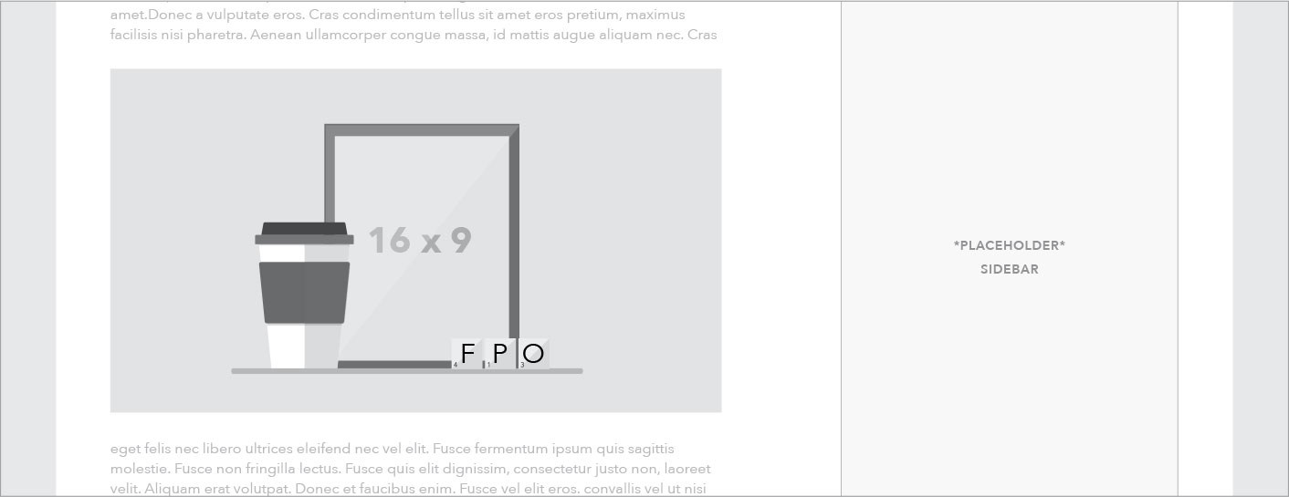
Full width text
Example
HTML code
Jinja2 template code for Wagtail CMS
The full width text component is the foundation of the main content area of many pages. Spanning the full main content area within a given template, it houses basic text content that follows our typographic hierarchy with the option to add pull quotes, media, inset information, and tables in-line.
Below are variations of the full width text element:
Use case
Content
When to use
- When there are multiple paragraphs of text to be shown on a page. Especially if multiple sections are involved.
- When text content is the main focus of a page.
When something else is better
- When the goal of the text is to quickly inform users about a set of options and/or drive them to child pages other sections of the site. Consider using the half width link blob.
Where to use
Media
When to use
- When an image is needed in the context of a passage of text
- On a blog or article page when more images are needed that the featured image
When something else is better
- When a single video is being featured on a page. Consider the featured content module.
- When multiple columns or a grid of images are needed
Inset
When to use
- When ancillary information is needed in context of flowing text, such as quotes, call to action, related links, etc. Only add related links within page text when the links are directly related to and referenced in a specific part of the text. Generally related links should go in the sidebar.
- May be used in any full width text component, but recommended only for Learn pages.
When something else is better
- May be used in any full width text component, but recommended only for Learn pages.
Tables
Tables follow the established patterns and use cases.
Behavior
Content and media
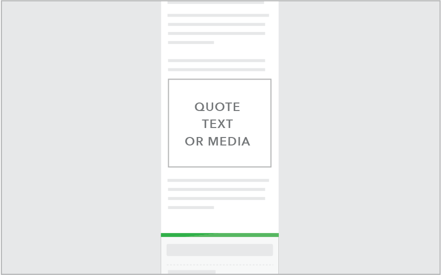
Content and media elements that are full width at desktop size remain full width across all breakpoints. Heading, link, and buttons all follow responsive patterns.
Sidebar 901+
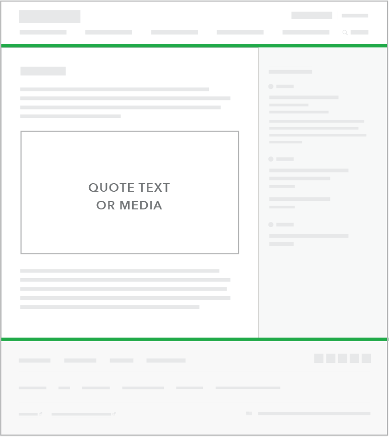
Sidebar less than 600
Inset
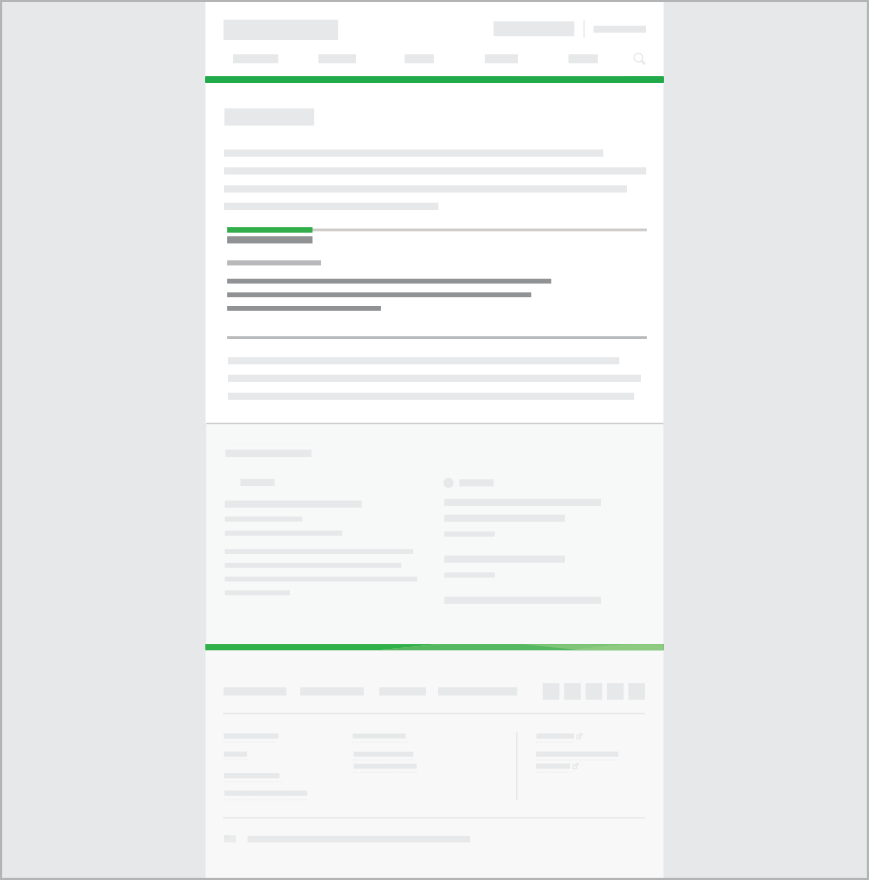
All variations of inset elements move into full width format at screen widths less than 600px as seen below.
Sidebar 601+
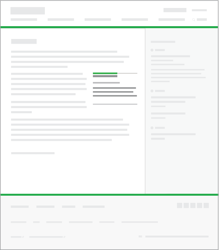
Sidebar less than 600
Content guidelines
Content guidelines will be dependent on the type of element that is inserted into the content area. See individual component guidelines for specifics.
Style
Content and media

- Quote or media container padding: 30 px top and bottom. Side padding is removed so element is flush left and right.
- Insets follow this format below 601px breakpoint
Inset

- Width: 270px for 601 px breakpoint and above.
- Padding: 30px all sides for 601 px breakpoint and above.
- Alignment: right side of main content
- Rule line: Top rule is optional
- Elements within the the inset (links, call to action etc) follow prefooter styling below 601 px


