Modal windows
Example
HTML code
Jinja2 template code for Wagtail CMS
Modal windows (also known as dialog boxes or lightboxes) are “pop-up” elements that appear in front of a web page, blocking the main page below. Similar to popup windows or system alerts, modals are unique because they prevent interaction with the page underneath. {: class=”lead-in”}
Use cases
Modals help draw attention to an alert or a focused task by preventing interactions with anything on the web page other than the modal itself. Due to their disruptive nature, modal windows should only be used in very specific cases outlined below.
Feedback or correction
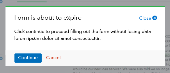
Modals can be effective for communicating a warning or alert outside the main web page. They can be triggered by a user interaction (like pressing a button to “save”) or without an interaction (like a timeout warning after a period of inactivity).
Interruption
Use modals to force the user to complete a task or make a decision that requires their full attention outside of the main workflow. A critical piece of this scenario is that you need the workflow to be interrupted to be effective. If not, explore other UI elements to accomplish the goal.
Examples of when to use modals
- Confirm an action that can’t be undone, such as “Are you sure you want to delete this?
- Display a warning that something is about to expire or timeout
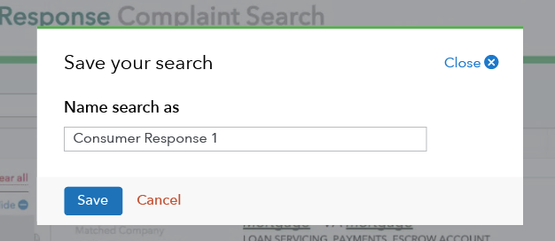
- Save a form that requires inputs separate from the main workflow, like entering a “Save as” file name
- Focus attention on the need to accept or acknowledge something before the user can proceed

Behavior
Opening a modal
Modals can be triggered by links, buttons, or even inactivity on a site. When a modal opens, set the focus to the first element users need to interact with. This could be either the first form field in the modal window or the primary action button.
Scrolling within a modal
Modal windows should not scroll. If a modal contains enough information to require scrolling, use an alternative method of displaying content, such as a different UI element or another content page.
Closing a modal
Actions inside modals should be clearly marked. There should be a clear path forward (“continue”) and back (“cancel”), in addition to a clearly labeled way to close the modal without taking any action at all. When a modal window is closed, return focus to the last active element on the page behind the modal.
Modal windows are always closable by clicking or tapping:
- A delete minicon or label in the upper right corner
- The next action button or link
- Anywhere outside the modal window
- ESC key on a keyboard
Creating accessible behaviors
Keyboard access should be limited to only interacting with the modal dialog once it is visible.
- The close minicon needs to be accessible from a keyboard.
- The escape key should also close the modal.
- The enter key should should be mapped to any submission forms in the modal.
Provide separate focus and hover states for the close minicon and any “next” action buttons.
The find function (ctrl+F) will not search information contained within a modal window.
Include offscreen instructions that describe the modal dialog and how to interact with it.
Specific development directions
- Modal windows should be marked with aria-hidden=”true” and toggled to false when visible and given the role=dialog ARIA role.
- When the modal dialog is displayed, the main content of the page should be marked with aria-hidden=”true” to prevent screen readers from interacting with it.
- Add role=”alertdialog” to the modal window.
- Code the close minicon using a button element for more semantic markup.
- The heading of the modal dialog should use an H1 tag.
- Offscreen interaction instructions should use aria-labelledby attribute.
Content guidelines
Heading
Modal windows should have a clear heading at the top of the window. This heading should clearly state what is happening or what action a modal is prompting the user for. For instance, if a modal appears due to inactivity, the heading should clearly state the action that is about to take place due to that inactivity.
Supporting text
Any copy underneath the heading should include clear instructions about what the user needs to do.
Form fields
If form fields are included in a modal, they should follow standard form field design guidelines.
Style
Modal window box
- Alignment: centered horizontally and vertically on top of lightbox
- Background: White (#ffffff)
- Background lightbox: Gray 80 (#75787b), 70% opacity
- Padding: 30px
- Top border: 3px, CFPB Green (#20aa3f)
- Heading: Avenir Next Regular, 22 px, Black (#101820)
- Supporting text: Avenir Next Regular, 16px, Black (#101820)
Close area
- Minicon: “close-round”
- Minicon color: Pacific (#0072ce)
- Minicon size: 16px
- Font: Avenir Next Regular, 16px, Pacific (#0072ce)
Gray action bar
- Background: Gray 5 (#f7f8f9)
- Padding right/left: 30px
- Padding top/bottom: 10px
- Primary action: left aligned button
Maximum width
- 270px for small screens
- 630px for medium and large screens
Inactive window
- Set page to fixed

