Responsive Web Design
Class 1
Class 1 Slides:
cfarm.co/rwd1
Welcome!
Girl Develop It is here to provide affordable and accessible programs to learn software through mentorship and hands-on instruction.
Some "rules"
- We are here for you!
- Every question is important
- Help each other
- Have fun
Welcome!
Tell us about yourself.
- Who are you?
- What do you hope to get out of the class?
- What's something no one in this room knows about you?
Terms
-
Responsive DesignFluid grids + Flexible Images/Video + Media Queries
-
ViewportThe visible area of a webpage in a browser window
-
Mobile AppSoftware that is downloaded to a mobile device - we will not cover this.
-
Mobile websiteA separate website with its own domain built to target 'mobile devices', typically meaning smartphones. We're not covering this either.
Tools
-
Browser:ChromeFirefox
-
Development Toolkit:Chrome - InspectorFirefox - Firebug
-
Text Editor:
-
FTP Program:
What is Responsive Web Design?
Responsive web design is an approach to web design in which a site is crafted to provide an optimal viewing experience—easy reading and navigation with a minimum of resizing, panning, and scrolling— across a wide range of devices (from desktop computer monitors to mobile phones).-Wikipedia
Examples
Why bother?
As of May 2013:
- 56% of American adults have a smartphone
- 28% of cell owners own an Android
- 25% own an iPhone
- 4% own a Blackberry
- 34% of American adults own a tablet computer
Goal for Today
Create a page that changes when you resize the browser viewport, and that fits on a mobile device screen.
Four Keys to Responsive Design
- A Fluid Grid
- Flexible Images
- Media Queries
- Viewport Meta Tag
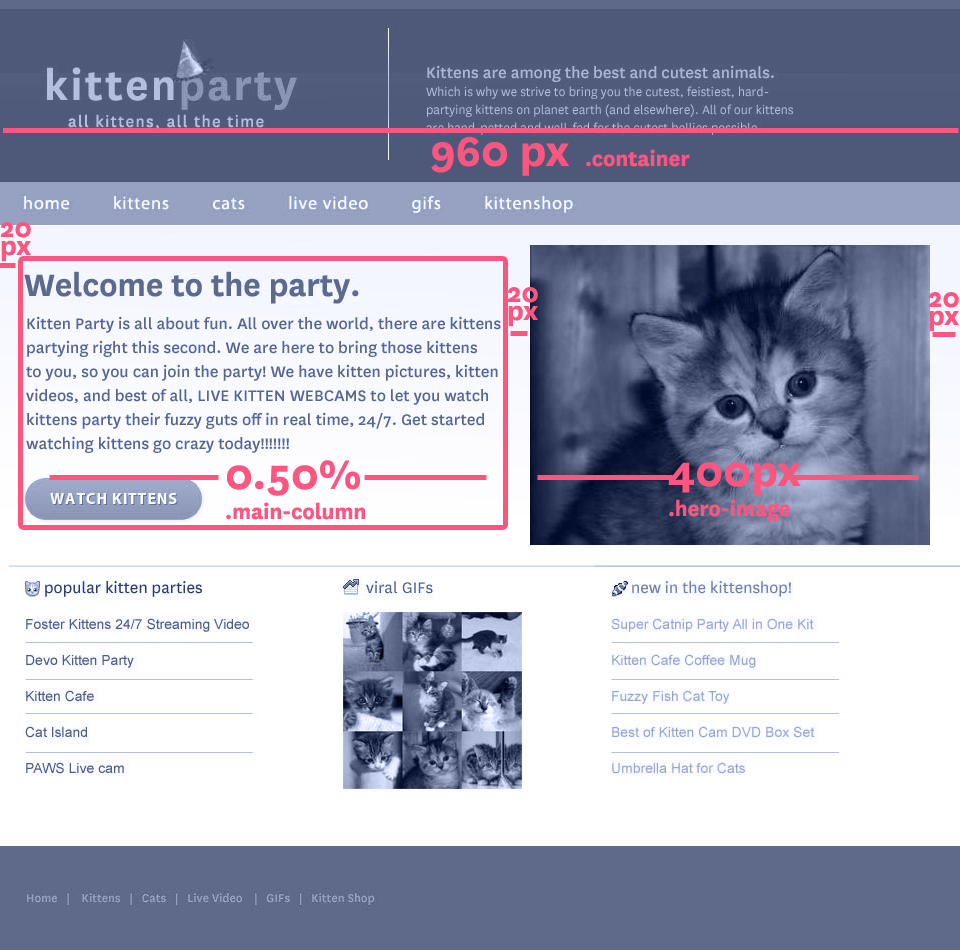
The Fluid Grid
- Define container widths as % instead of px
- Target ÷ context = result (Important - write this down!)
Target ÷ context = result
- Target = width you desire in pixels
- Context = the container of the element - a div or could be the viewport
- Result is a percentage value you can use as a width in your CSS
The Fluid Grid

The Fluid Grid

The Fluid Grid
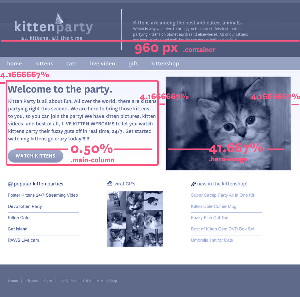
480px ÷ 960px =
.50
.50
The Fluid Grid
.50 =
50%
50%
The Fluid Grid
The Fluid Grid
The Fluid Grid
.container {
  width: 960px;
  margin: 0 20px;
}
.main-column {
  width: 480px;
  margin-right: 20px;
}
.hero-image {
  width: 400px;
}
The Fluid Grid
.container {
  width: 960px;
  margin: 0 4.1667%;
}
.main-column {
  width: 50%;
  margin-right: 4.1667%;
}
.hero-image {
  width: 41.667%;
}
Let's Develop It
- Open up your template index.html file in a browser
- Open style.css in the css folder in a text editor
- Make your page layout fluid!
- Hint: try this helpful calculator at rwdcalc.com
- Bonus: Test on devices by uploading your files via FTP
.container {
  width: 100%;
  margin: 0 4.1667%;
}
.main-column {
  width: 50%;
  margin-right: 4.1667%;
}
Upload via FTP
- Download FileZilla
- Use username, server name, and pw to connect
- Create a directory using your first name
- Copy your files to your directory
Viewport <meta> Tag
Makes your page scale correctly on mobile devices.
<meta name="viewport" content="width=device-width">Uncomment line 18 in your index.html file and compare on a mobile device to see the difference.

Flexible Images
Like with fluid grids, percentages make images flexible in a page
img {
  max-width: 100%;
}
Let's Develop It
Add the following code to your hero-image div:
<img src="http://placekitten.com/400/300"
alt="pensive kitten">
What happens when you resize the page?
Now add this to your style.css:
 img {
  max-width: 100%;
}
Flexible Images
What if you don’t want it to be 100% wide?
<img src="http://placekitten.com/400/300"
alt="pensive kitten"
class="small-image">
.small-image {
  float: left;
  width: 50%;
}
Questions?
?