Heroes
Example
HTML code
Jinja2 template code for Wagtail CMS
Heroes function as a primary focal point on a page, often used to introduce a collection of pages by combining a brief description of the goals of that section along with a visually impactful graphic.
Source Code
-
cf-layout
Heroes in Capital Framework
Use case
Heroes are the most prominent component on a page, in terms of their position and visual footprint. Heroes should only be used on top level pages, including landing and sublanding pages.

When to use
- When orienting a user to a new section or topic
- When the page serves as a navigational tool with general information about a subject and links to lower-level pages that contain more specific information
When other options are better
- When introducing a specific piece of content, like a blog, press release, or other lengthy or detailed content, use the text introduction
Behavior
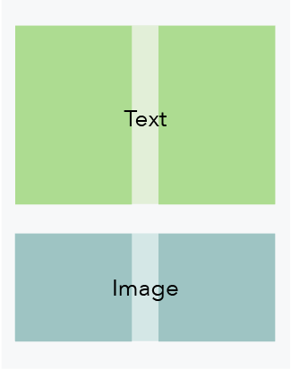
Below the 601 px breakpoint, the text and image stack to span the full width of the viewport.
601 px and above

600 px and below
Content guidelines
Hero content should serve to orient the user and communicate the primary goal of the page. Copy should be succinct and engaging, reflecting the voice and tone of the CFPB.
Purpose
Hero copy should be written from the user’s perspective. It’s less about what we can do for them or what we can offer them, and more about what the user can do with the resources we provide.
Hero content should help a user answer these two questions:
- Is this page what I was looking for? (orient the user)
- Do I want to keep reading? (engage the user)
Since the goal of the hero is to get the user to continue reading the page, don’t include links or calls to action within the hero. If there is content that needs to link elsewhere for explanation, place it underneath the hero within the main content area.
Writing hero content
Heading
Headings should communicate what the user can learn from the page or the benefit the page provides. Headings should be a single phrase, preferably one line at the largest breakpoint. Take care to avoid orphaned text.
Headings should not include a period at the end. Question marks can be used when a question is asked, but avoid phrasing heroes as questions. Actionable, descriptive, orienting statements work best.
- One-line (at largest breakpoint): 41 characters maximum
- Two-line (at largest breakpoint): 82 characters maximum
Subheading
Subheading content should be brief, enticing, and build upon the heading to describe the value of the page. Take care to avoid orphaned text.
- After one-line heading: Between 165 and 186 characters (three lines at largest breakpoint)
- After two-line heading: Between 108 and 124 characters (two lines at largest breakpoint)
StyleView code
- All illustrations should be saved at 200% to accommodate retina displays
- When saving illustrations, use a transparent background
Standard hero
Illustration (no bleed)
- Single image for both large and small screens
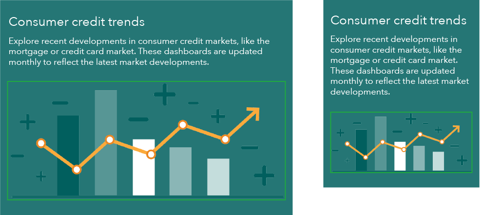
- Illustration dimensions: 470px (exact) x 195px (maximum) (2x: 940px x 390px)
Large screens (601+)

Small screens (600-)
Hero variations
Photo
- Two images must be created, one for large and one for small screens
- Large and small screen images should contain the same elements but can differ compositionally
- When selecting a photo include a 30px horizontal margin of clear space between text and image area
- Type contrast ratios cannot be mathematically determined for photos so special care should be paid when selecting these images
- To conserve vertical space, small screen image should be as short as possible
- Photo dimensions for large screens (exact): 1230px x 285px
- Photo dimensions for small screens: 600px (exact) x 338px (maximum)
Large screens (601+)

Small screens (600-)
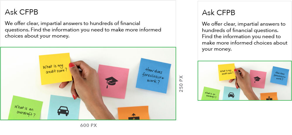
Illustration (bleed)
- Two images must be created, one for large and one for small screens
- Large and small screen images should contain the same elements but can differ compositionally
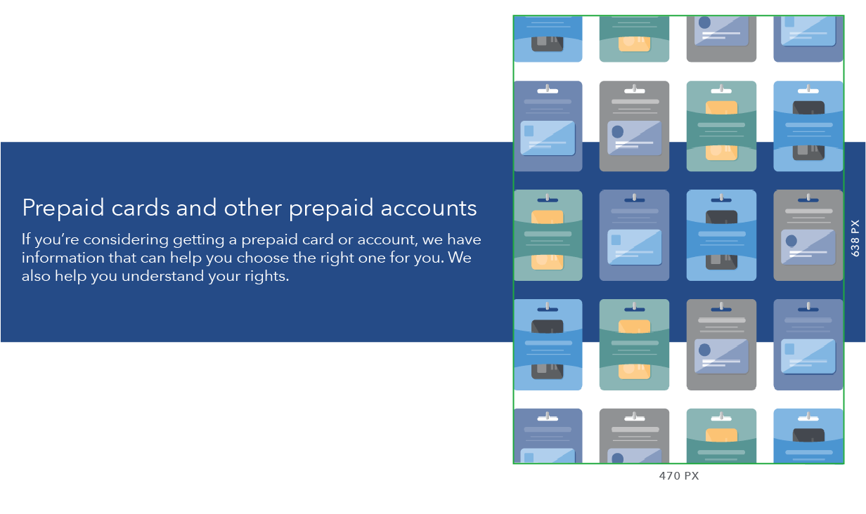
- On large screens, illustration bleeds top and bottom
- Large screen image dimensions are based on maximum possible hero height at 601px width
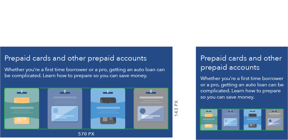
- To conserve vertical space, small screen image should be as short as possible
- Illustration dimensions for large screens (exact): 470px x 638px (2x: 940px x 1276px)
- Illustration dimensions for small screens: 570px (exact) x 320px (maximum) (2x: 1140px x 640px)
Large screens (601+)
Small screens (600-)
Style at different breakpoints
901px and above
- Heading: H1
- Subheading: Avenir Next Regular, 22px/28px
- Top and bottom padding: 45px
- Left and right padding: 30px
- Text is vertically centered
- Total height is 285px (fixed)

Between 900px and 601px
- Heading: H2
- Subheading: Avenir Next Regular, 18px/22px
- Padding on all sides: 30px
- Module height is flexible to text height

600px and below
- Heading: H2
- Subheading: Avenir Next Regular, 18px/22px
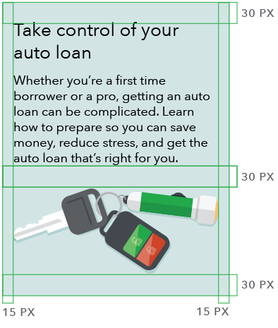
- Top and bottom padding: 30px
- Left and right padding: 15px
- Module height is flexible to text height
