Responsive Web Design
Class 3
Class 3 Files:
cfarm.co/rwd3
Review
How do we make things stack?
- No floats, and div will fit the width of a screen automatically.
- Can add width: auto, width: 99% or width: 100% to make divs explicitly fit screen width.
- Add padding or margins as needed
Review
How do we make columns for larger screen sizes that have room for them?
- Add floats inside a media query
- Add or remove padding, margins, heights as needed
Wednesday's Homework
- Add media queries for breakpoints that are the size of popular mobile devices (phones, tablets, etc)
- Look up these screen resolutions - try looking up your own devices
- Try changing the widths at these breakpoints to mimic the rigid grid layouts we looked at.
Breakpoints
These can be based on popular device sizes, like iPhone, iPad and desktop resolutions:
.container { width: 100%; }
@media only screen and (min-width:320px) {
  .container {
    margin: 0 auto;
    width: 320px;
  }
}
@media only screen and (min-width: 768px) {
  .container {
    width: 768px;
  }
}
@media only screen and (min-width: 960px) {
  .container {
    width: 960px;
  }
}
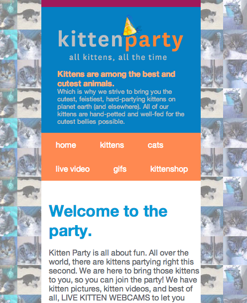
Example: Eataly
Media Queries for Screen Resolution
Some computers have different resolution density. You can target displays on iPhones and iPads, for example:
@media (-webkit-min-device-pixel-ratio: 2),
(min-resolution: 192dpi) {
  .logo {
    background-image: ('logo_retina.png');
  }
}
Media Queries for Screen Resolution
If you use this for images, you also need to change the background-size property:
@media (-webkit-min-device-pixel-ratio: 2),
(min-resolution: 192dpi) {
  .logo {
    background-image: url('logo_retina.png');
    background-size: 100%;
  }
}
Let's Develop It
- Add a retina (2x) media query to your CSS to change the logo image.
- Remember to change the background-size value!
@media (-webkit-min-device-pixel-ratio: 2),
(min-resolution: 192dpi) {
  .logo {
    background-image: url('logo_retina.png');
    background-size: 100%;
  }
}
Breakpoints
Breakpoints can also be more fluid, and added only where the layout starts to look funky:
.hero-image { width: 100%; }
@media only screen and (min-width:530px) {
  .container {
    float: left;
    width: 41.6666666666667%; /* 400px/960px */;
  }
}
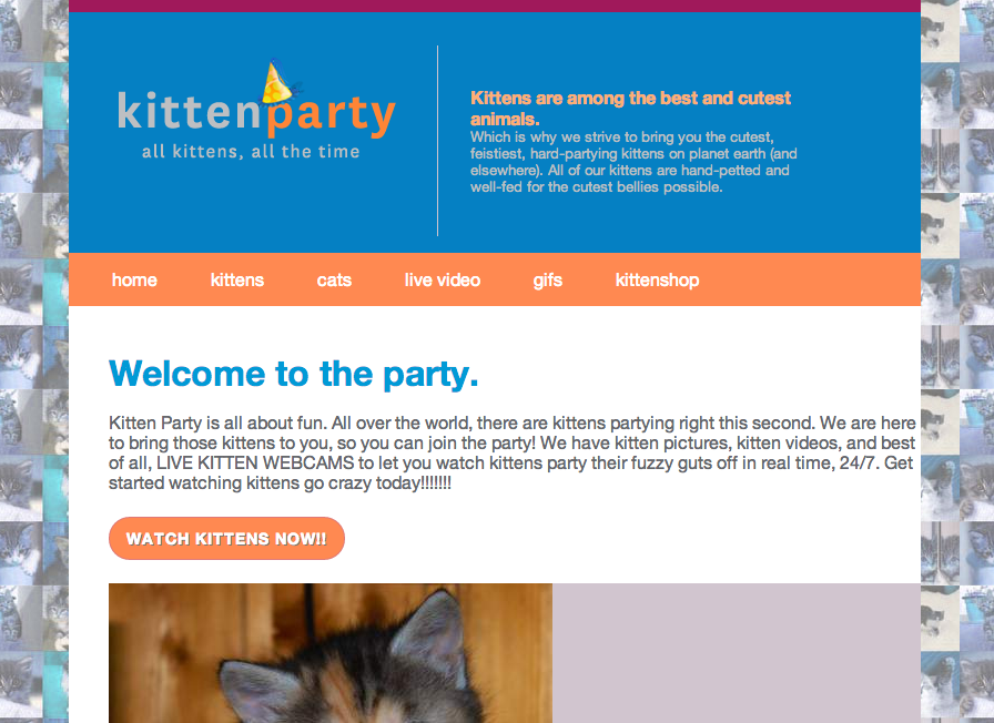
Example: BohConf
Goal for Today
Best Practices
Terms
-
Best PracticeMethod or technique that has consistently shown results superior to those achieved with other means, and that is used as a benchmark (Wikipedia)
-
Design PatternDescribe solutions to common usability or accessibility problems in a specific context(Wikipedia)
Mobile Web Design
Best practices recommended by the W3C:
- User experience is consistent across devices
- Flexible styling is used instead of fixed pixels
- Relevant content is most prominent element on a page
- Irrelevant content does not appear
Mobile Web Design
User Experience: Ensure that content provided by accessing a URI yields a thematically coherent experience when accessed from different devices.

Mobile Web Design
Testing: Carry out testing on actual devices as well as emulators.
Mobile Web Design
Layout: Use percentage and relative measures such as ems.

Mobile Web Design
Markup: Organize documents so that if necessary they may be read without style sheets.
Mobile Web Design
Content: Limit content to what the user has requested.

Mobile Web Design
Content: Limit content to what the user has requested.


Mobile Web Design
Content: Ensure that material that is central to the meaning of the page precedes material that is not.

Let's Develop It
- Add media queries to make our content appear first on the page
- Keep in mind mobile web design best practices to find elements that need to change.
- Change styles to make nagivation and header less prominent, and text content the main feature without user having to scroll. Design guideline
- Helpful tools:
- Breakpoint Finder - works on local sites
- Window Size Bookmarklet
Mobile Web Design
Navigation Best practices recommended by the W3C:
- Provide only minimal navigation at the top of the page.
- Provide consistent navigation mechanisms.
- Clearly identify the target of each link (e.g. no use of "Click here").
- Do not change the current window without informing the user.
Provide only minimal navigation at the top of the page

Provide consistent navigation mechanisms

Clearly identify the target of each link
(no "Click here").

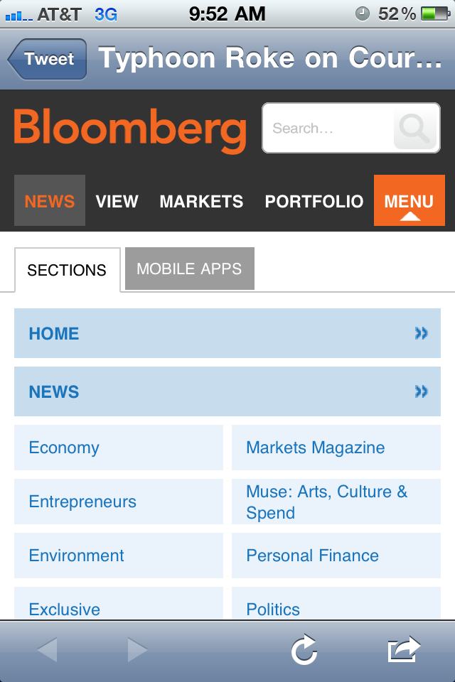
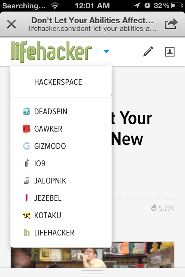
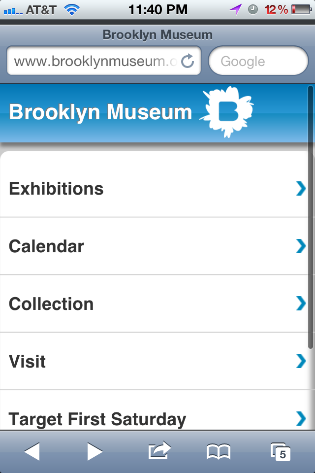
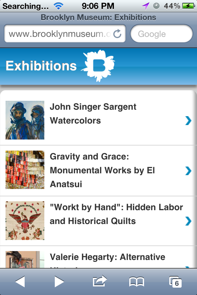
Navigation Patterns
(Responsive Nav Patterns)Navigating for Touch Devices
- Apple minimum tap dimensions: 44x44pts
- Windows Phone guideline dimensions: 32x32pts
- User experience research suggests even larger dimensions for fingers/thumbs: 72x72px
- Extra padding on links
- Extra space around links
Touch-friendly Nagivation
All touchable items on the page should be at least around 40x40pts, and should be at least around 10pts away from other touchable items.(Considerations for Mobile Design [Part 3: Behavior])
Touch-friendly Navigation
Your controls need to facilitate touch interaction. This might mean giving links in content body extra padding so they’re easier to tap. This might also mean you need to add extra space between items in an ordered list of links.(Considerations for Mobile Design [Part 3: Behavior])
Touch-friendly Links
Touchable items should look like touchable items on handheld devices.(Considerations for Mobile Design [Part 3: Behavior])
Style nav links or callout links as buttons with borders, bolded text & background colors that stand out from other non-nagivation links and text.
Homework
- Use navigation best practices to make your nav menu touch-friendly and usable at small screen sizes.
- Use the "Nav Bar" or "Stacked List" design pattern to accomplish this for small screens.
- Use media queries to change the nav bar to match our original design at larger screen sizes where it fits the layout best.