Responsive Web Design
Class 2
Class 2 Slides:
cfarm.co/rwd2
Four Keys to Responsive Design
- A Fluid Grid
- Flexible Images
- Viewport Meta Tag
- Media Queries
The Fluid Grid
Q: For fluid grids, container widths should use ___? instead of pixels
A: Percentages
The Fluid Grid
Q: What is the formula to calculate your width percentage?
A: Target ÷ context = result
Viewport <meta Tag>
Q: The Viewport <meta> tag changes the _____? of your HTML document:
- Width
- Aspect Ratio
- Scale
- Height
A: C. Scale
Goal for Today
Monday's Homework
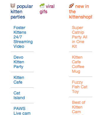
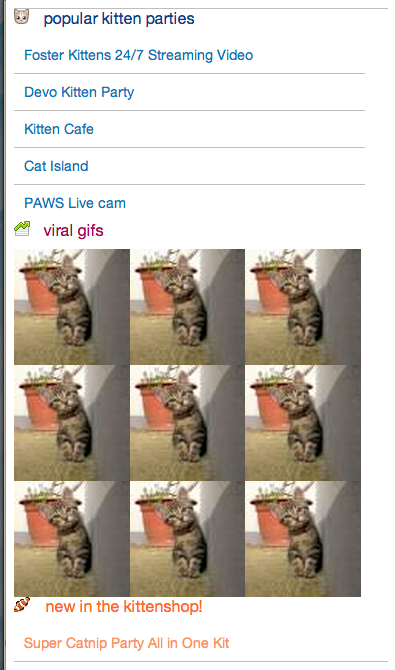
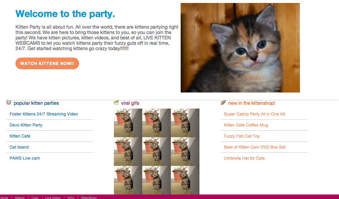
Using percentage widths & flexible images, add some cat photos to your page to match our design:
- One large hero image
- 9 small images in a div

Max Width Styles
For many responsive styles, you want to impose a maximum width on your elements that have percentage values:
.gifs img {
  width: 33%;
  max-width: 85px;
}
Let's Develop It
- Add max-width values to your elements with percentages.
- Hint: Use your old pixel width values for your max-width values. (Aren't you glad you kept those in a comment?)
.gifs img {
  width: 33%;
  max-width: 85px;
}
.container {
  width: 100%;
  max-width: 960px;
}
Fluid Video, etc.
- Video, slideshows, etc can also be made flexible
- For video: FitVids.js jQuery plugin
- For slideshows: make your images flexible with max-width technique. We'll make a touch-friendly slideshow in an upcoming class.
Fluid Grid Problem!
Sometimes our fluid grids are too small to fit our content nicely in our design at small screen sizes:
Media Queries
Media Queries apply CSS based on conditions that you decide (usually width, but can also be resolution, device size, height, media type).
@media print {
  * {
    background: white !important;
  }
}
@media only screen and (min-width:600px) {
  header {
    /* styles for only 600px wide & up */
  }
}
Media Queries
Just like with a print stylesheet, you can add media queries based on screen size to any element you want:
Media Queries
Most important elements to target with media queries are usually layout-related, like your fluid grid styles.
.container {
  margin: 0 auto;
  width: 100%;
}
@media only screen and (min-width:960px) {
  .container {
    width: 960px;
  }
}
Let's Develop It
Fix your squished grid callout styles:
- Move your .callout divs' width and float styles inside a media query
- Fix styles as needed for your default CSS
@media only screen and (min-width:960px) {
  .callout {
    margin: 0 ??% 0 0;
    width: ???%;
    float: left;
  }
}
Callout Divs Stacked
Here's how our callout divs should look now, without floats or widths on the left, and with floats and widths on the right:
Media Queries
Media queries can also use:
- em values instead of pixels
- max-width
- min AND max-width parameters
- resolution parameters
- many more
Media Queries with Ems
Convert pixel values to ems with pxtoem.com
@media only screen and (min-width:60em) {
  .container {
    width: 100%;
    max-width: 960px;
  }
}
Media Queries using Max-Width
Use multiple parameters to target in-between sizes (aka breakpoints)
@media only screen and (min-width:700px) and (max-width: 800px) {
  .nav {
    font-size: 110%;
  }
}
Let's Develop It
Make a mobile-first responsive site:
- Move ALL your floats & widths into a media query for 960px wide viewports and up.
- Fix styles as needed for your default CSS - this is the mobile first stuff!
- Resize browser & test on devices to see your media query kick in at the larger screen size.
- BONUS! Use ems instead of pixels for your media query breakpoint.
Breakpoints
The points in your layout where you add a media query, or where things shift and change.
/* this is a 60em or 960px wide breakpoint */
@media only screen and (min-width:60em) {
  .container {
    width: 100%;
    max-width: 960px;
  }
}
Breakpoints
These can be based on popular device sizes, like iPhone, iPad and desktop resolutions:
.container { width: 100%; }
@media only screen and (min-width:320px) {
  .container {
    margin: 0 auto;
    width: 320px;
  }
}
@media only screen and (min-width: 768px) {
  .container {
    width: 768px;
  }
}
@media only screen and (min-width: 960px) {
  .container {
    width: 960px;
  }
}
Example: Eataly
Breakpoints
Breakpoints can also be more fluid, and added only where the layout starts to look funky:
.hero-image { width: 100%; }
@media only screen and (min-width:530px) {
  .container {
    float: left;
    width: 41.6666666666667%; /* 400px/960px */;
  }
}
Example: BohConf
Let's Develop It
- Add media queries for breakpoints that are the size of popular mobile devices (phones, tablets, etc)
- Look up these screen resolutions - try looking up your own devices
- Try changing the widths at these breakpoints to mimic the rigid grid layouts we looked at.
- Helpful tools:
- Breakpoint Finder - works on local sites
- Window Size Bookmarklet
- Responsinator - mimics real device sizes